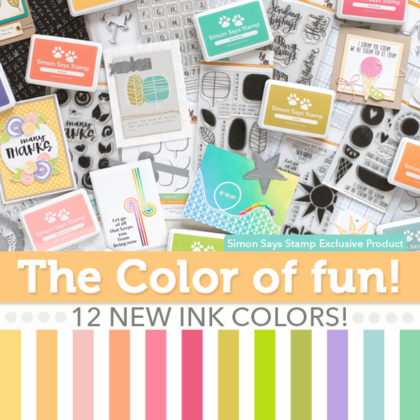
 Whoo Hoo! I have new goodies from Simon Says Stamp to share with you today! Simon Says Stamp sent me a few items from the new release ahead of time so I could create and hopefully inspire you! I have already placed an order too for a couple other sets and some more inks!
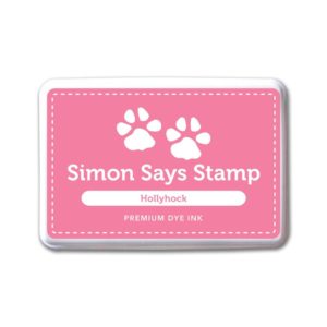
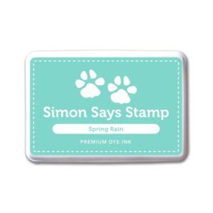
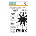
For my first card I used the new Cone Builder clear stamp set, My Sunshine clear stamp set and Coordinating Dies. I also used new inks in Spring Rain and Hollyhuck.
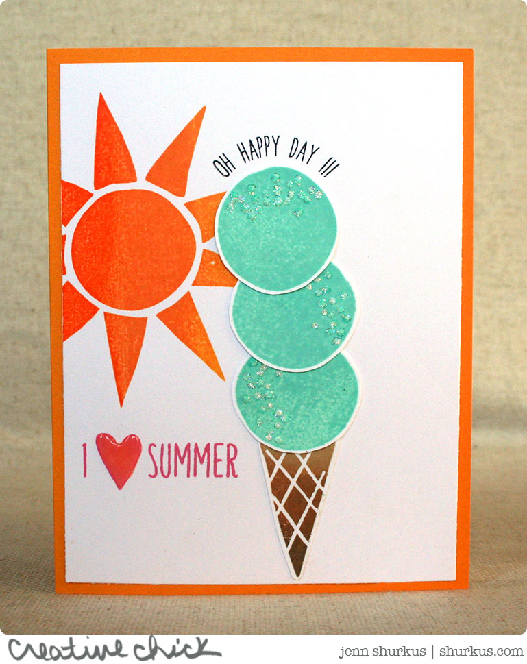
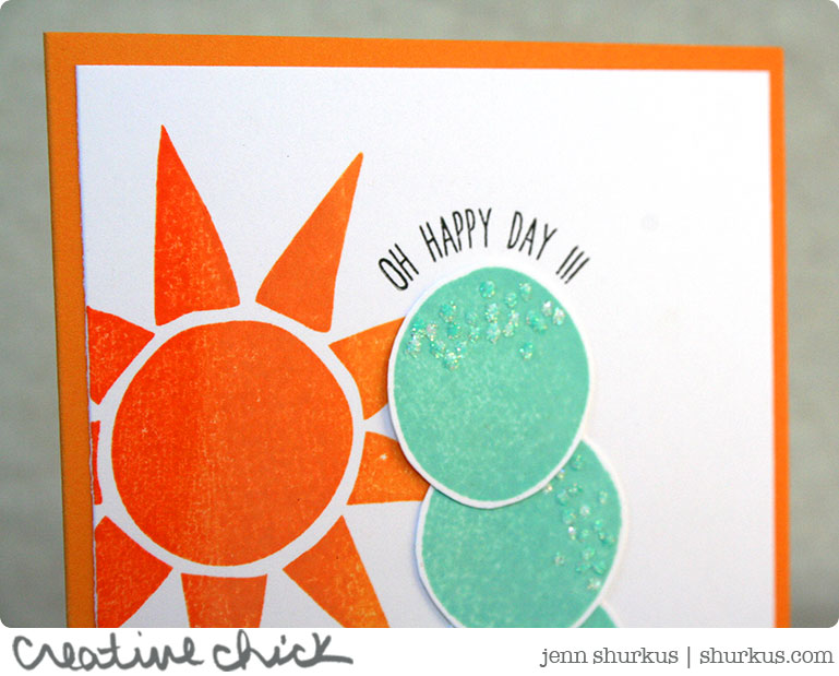
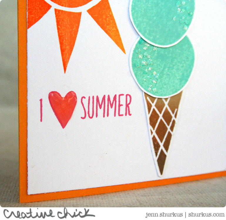
I also used Hero Arts Ombre Inks in Butter to Orange (on the sun) and Sand to Chocolate (for the cone). A touch of ultrafine glitter with my quickie glue pen for the sprinkles and a little glossy accents on the heart are some finishing touches I added.
The second card I created I feel still needs something. But I decided to still share it with you to hear your ideas
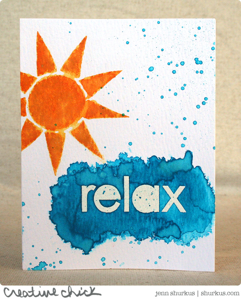
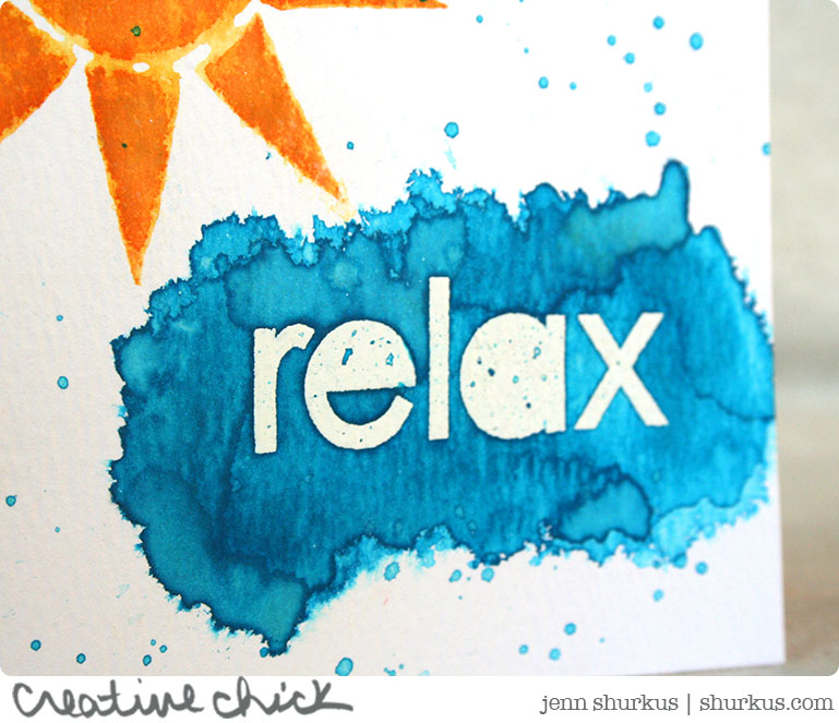
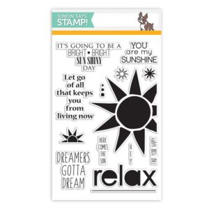
For this card I used the My Sunshine clear stamp set. I stamped the sun using Wild Honey and Rusty Hinge Distress Ink. Once I stamped it on Distress Watercolor Cardstock I used a waterbrush to move the color around a bit. I then embossed the word relax with white embossing powder. I painted a yummy area of color with Mermaid Lagoon Distress Ink. I then splattered some ink around the card.
So, I feel like this card still needs a little something. I was thinking maybe something black and bold? or die cut some clouds out of vellum or white felt? I’m just not sure. Do you have any ideas? Leave me a comment below I would love to hear them! I will share this card again when it is “finished” 🙂
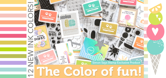
All of these new products from Simon Says Stamp Color of Fun release are available NOW! I have already placed my order for a few more things I just NEEDED to have 😉 I have linked below the supplies I have used, or you can see the full release by browsing here.











Lovin the glitter on the ice cream cone. What a darling set and card.
Looks like Simon has some great new stuff!!!!
Beautiful cards. Thank you so much for sharing them.
I see some deep green on there… I don’t know if you have a stencil that resembles seaweed but that’s what I imagine! And texture paste with some ultrafine glitter, but that’s because it’s one of my favorite things to see on your cards & it would enhance the beauty of this one.
Jenn, these new ink colors are so vibrant and gorgeous! I looked at that second card for a while to decide whether I thought it needed something else. I love the blues and oranges, what a gorgeous contrast. And because you have the blue water like splashes so well positioned around the sun, IMO, it’s complete and gorgeous! Embellishments may take away rather than add.
How about cutting up one of the sentiments or stamping in black under relax. Here comes the Sun.?